
Practice Management Website Redesign
It was time for a website refresh; their current website had usability, organization and functionality issues, causing problems for healthcare providers. The challenges and goals for this project were to redesign the website from the ground up.
Process
Throughout this project, I drove our design process and ensured it was as user-centered as possible. This was a quite long and complex project; here’s a very high-level overview of what our process looked like.
Baseline measurement & insights: analytics & site survey review, usability testing
Before we got into the redesign, we wanted to get a handle on trends and problems with the current website. I did an early sub-project that involved the following:
-
Search analytics review: Taking the top 50 search terms over a 3-month period, I used both site search and navigation to attempt to find each term.
-
Interviews & baseline usability testing: I did quick user interviews with healthcare providers & staff in the medical centre, along with semi-structured interviews and usability testing with ‘health optimizers;’ 18 people in all. The goal was to understand more about what problems healthcare providers are having with the use of the current version, how they get information about their care and the medical centre, and to discover additional usability issues.
-
Analyzing open-ended results from a recent survey about the website
-
Analyzing website analytics (focusing on mobile)
-
Synthesizing prior recommendations made by healthcare providers
I assembled a report with key insights and recommendations, organized according to the difficulty level.
Competitive analysis & inspiration gathering
I put together an internal deck that pulled together our team’s favourite examples of interesting practice management websites from around the country.
.png)
Feature & content requirements
I kept a running list of requirements, thoughts, and ideas as our project progressed. It’s just a big old document and not much to look at, but it helped prevent the team from forgetting loose ends, and it set the stage for content mapping and user story creation.
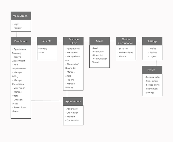
Information Architecture
Early on in this process, our team needed to totally rethink the website’s information architecture. Having audited our content and gathered inspiration from other successful websites, we went through a few exercises:
Using a representative sampling of website topics, team members organized them into ‘like’ categories and named the categories.

Content mapping
Our team also had to spend a lot of time thinking about different content types; I mapped out a diagram of our content types (e.g. our ‘nouns’) and how they related to one another. This helped us start to plan and account for interface requirements.
Personas
Using data collected throughout the project, I put together a set of 4 personas to represent some of our key users’ needs, goals, and states of mind. During this project I read about the importance of the ‘stress case’ (or worst-case scenario) that users may encounter. This is especially important in healthcare. For our stress case, we created a special corner who is in an emergency health situation.


Design principles
I put together a set of 10 design principles that our team referred to constantly throughout the project. “Put patients first” was one of our most important principles, because our website tended to use organization-centric language and navigation. Importantly, we got ‘sign off’ from top healthcare providers on these principles at the very beginning of our process.
Sprint planning, user story writing
Our team organized our work into design sprints, which included design collaboration in the team, review with the full team, usability testing if at all possible, department review as needed, design revisions, and planning the following sprint. My manager took the lead on sprint planning, and I wrote user stories for each feature.
This was quite a lot of work, but there isn’t a great visual for it. Lots of thinking, writing, and collaboration.
Sketching, prototyping, design system planning
We collaborated closely on interface design. We spent a lot of time drawing together, and we co-developed all of our responsive design system components.’ I basically created wireframes or low-fidelity mini-prototypes for each component, key page, and complex flow (like site search and ‘find a doctor search), while others created more refined visual comps and an interactive and responsive HTML prototype.
Usability testing
Using Connect’s visuals, we also put together a quite comprehensive, clickable Adobe XD prototype that we used for usability testing (approaching patients and visitors in the hospital lobbies) and department presentations. I tested with users every few weeks through the latter half of our project, and we got important feedback that helped us make revisions along the way.
Here are some sample page snippets, at desktop size and prepped


Outcome
I hold this project as an example of an ideal user-centred design process, and the whole team was very proud of the work. While this complete design has not yet had the opportunity to get built, aspects of it have been folded into the existing website.